Customer Scoring Matrix
The Customer Score Matrix is a scatter plot that displays your entire customer base and is structured as follows:
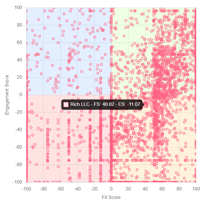
Each dot represents an individual customer, with their position determined by their Fit Score on the horizontal axis and their Engagement Score on the vertical axis. The graph is divided into four quadrants:
- Top right quadrant (Green): This quadrant represents well-performing customers who have the highest potential for upselling.
- Bottom right quadrant (Orange): This quadrant includes customers who fit the profile of your ideal customer but are not fully utilizing your product. These customers need more attention to move them into the top right quadrant. There is a high risk of churn for these customers.
- Top left quadrant (Blue): This quadrant contains customers who are using your product sufficiently but do not fit the profile of your target customer.
- Bottom left quadrant (Red): This quadrant identifies customers who do not fit your target group and are also not utilizing your product sufficiently. These customers are the most likely to churn.
To maintain clarity, we limit the number of displayed customers to 10,000. If you have more than 10,000 customers, you need to segment a specific portion based on more detailed parameters to display in this graph. Examples of how to use it with segments can be found in the articles related to segments.